Back to Database
Flowbite
VERIFIED

Flowbite

75
0.0(0)

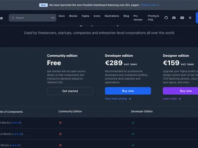
Flowbite offers 600+ free & premium UI components and templates built with Tailwind CSS to accelerate your web development projects.

Dev ToolsFreemium

Boost this tool

Subscribe to listing upgrades or segmented pushes.

Log in to purchase

Overview

Flowbite is a comprehensive open-source and commercial library of UI components, sections, and pages built with Tailwind CSS and designed in Figma. It provides a robust foundation for web development, allowing developers to quickly build visually appealing and functional user interfaces. Flowbite accelerates development by offering ready-to-use, customizable components, saving significant time and effort compared to building from scratch.

Flowbite's components are styled using Tailwind CSS utility classes, offering flexibility and consistency. The library includes a vast collection of elements, ranging from basic buttons and forms to complex navigation menus and data tables. It also provides native dark mode and RTL support, enhancing accessibility and catering to a global audience. Furthermore, Flowbite offers framework compatibility for React, Vue.js, Svelte, and Angular, making it versatile for modern web development workflows.

Flowbite is perfect for web developers and designers who want to streamline their workflow and create high-quality web applications quickly. It's an excellent choice for those familiar with Tailwind CSS or looking to adopt a utility-first CSS framework. Whether you're building a simple landing page or a complex web application, Flowbite provides the tools and resources to create responsive, accessible, and visually appealing user interfaces efficiently.

Key Features

600+ UI Components: Offers a vast library of pre-designed elements for diverse web development needs, saving development time.
Tailwind CSS Based: Leverages the utility-first approach of Tailwind CSS for flexibility and consistency.
Figma Integration: Designed in Figma, enabling seamless design-to-development workflow.
Framework Compatibility: Supports React, Vue.js, Svelte, and Angular for broad application.
Dark Mode Support: Provides built-in dark mode functionality for enhanced user experience.
RTL Support: Offers full Right-to-Left (RTL) language support for global accessibility.
Flowbite Icons: Includes 400+ SVG icons for visual consistency and branding.
Responsive Design: Ensures a seamless user experience across various devices.
Customizable Components: Allows for easy modification and extension of components to fit specific needs.
Regular Updates: Continuously updated with new components and features to stay current with web development trends.

Use Cases & Problems Solved

Use Cases

  • Use when you need a pre-built library of Tailwind CSS components to accelerate web development.
  • Perfect for building responsive websites and web applications with a consistent design system.
  • Ideal if you need to integrate UI components seamlessly with frameworks like React, Vue.js, Svelte, or Angular.
  • Use when you want to leverage Figma designs and translate them into functional code quickly.
  • Perfect for projects requiring dark mode or RTL support, as Flowbite offers native compatibility.
  • Ideal if you need a large collection of SVG icons compatible with Tailwind CSS and Figma.
  • Use when building prototypes or MVPs and need to quickly assemble a functional user interface.

Problems Solved

  • Reduces development time by providing pre-built and customizable UI components.
  • Eliminates the need to write CSS from scratch, leveraging the utility-first approach of Tailwind CSS.
  • Solves design inconsistencies by providing a unified design system across all components.
  • Reduces the complexity of implementing dark mode and RTL support.
  • Eliminates the need to design and code basic UI elements, allowing developers to focus on core functionality.

Who It's For

Front-end developersUI/UX designersWeb development agenciesTailwind CSS usersFigma usersFull-stack developers

Fit Analysis

Best For

Best for front-end developers and UI/UX designers who need a comprehensive library of Tailwind CSS components to accelerate web development and create visually appealing, responsive web applications.

Not Ideal For

Not ideal for developers who prefer to build UI components from scratch or are not familiar with Tailwind CSS, as it relies heavily on the utility-first approach.

Metrics

Discovered12/26/2025
Reviews0
Saved By0 users

Related Tools